

(members only)
Heritage Hunt Photography Club

The House Across the Street--Composition Commentary
I’m trying something different. Rather than showing an image others might appreciate, I’m opting to show an image to illustrate some aspects of composition.
Sometimes we look at an image that simply appeals to us. It could be a very interesting subject or a situation that stirs our emotions. More often than not, there are “factors” that contribute to how we react to an image that we don’t notice as “factors”, they just contribute to our reaction without us being aware. More often than not, these are compositional elements that subtly contribute to the appeal of an image.
So, I’m going to illustrate a few of such factors. For sure, this is simply dipping one’s toe into the topic of composition. There are many other compositional considerations beyond what I’ll point out, so just consider my example as “tease” to see if it motivates you to dive deeper into the study of composition. Or just be thinking about compositional elements the next time you’re framing up an image.
To be sure, the purpose of using compositional techniques is not to have the viewer notice them per se, rather they silently contribute to the viewers reaction. A good analogy might be a tasty dish. The diner just knows they like it, but only the chef knows the ingredients. It’s how they all blend that’s important to the diner.
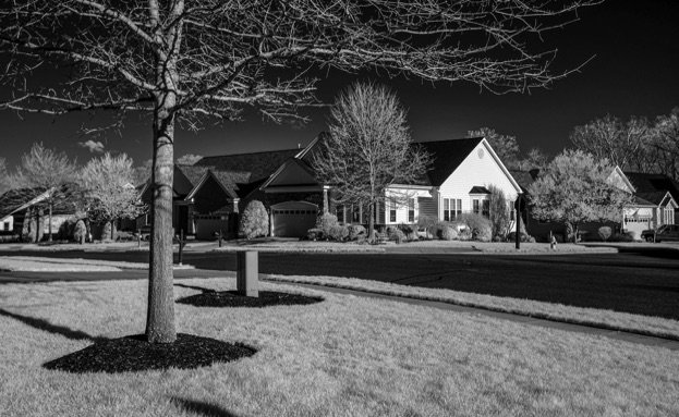
So here’s what I’m asking you to do: to start with, view only the first image…the one without any markings. Just react to the image. Does it appeal? What’s the subject? Does it draw you in? Is it flat or does it have depth? What leads your eye? etc. etc. For my purposes it really doesn’t matter if the image appeals to you, because it happens to be an image that can be used to illustrate a number of compositional considerations whether you like it or not. If it does appeal, perhaps the details I point out contributed to its appeal. if it doesn’t appeal, it’s also a lesson that you can’t save an unappealing image or subject with compositional details!!!
So view the image without markings, then come back to this commentary.
You might ask why did I take this picture? Looking outside one morning, I liked the high contrast light and that drew me outside, particularly for IR or B&W. I went out back but didn’t like anything I got, so tried the front yard. I do this often and just consider it photographer’s calisthenics. Work a situation and see if you can make an appealing image. Perhaps you delete the image but you are still left with the benefits of the calisthenics. But having done that practice will help you as you “work” your next image. Practice, practice.
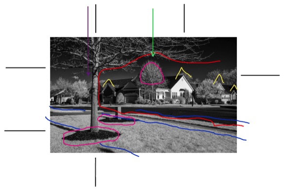
The close tree and the point of the roof on the house across the street attracted by attention. So, the challenge was to arrange them and and other elements, of which there were many. I did this by moving my feet and holding the camera higher and lower along with tilting it slightly up and down.
Composition Considerations:
Picked primary subject: point of the roof on the house across the street.
Secondary subject: the tree in my yard, in particular its truck and the horizontal branches.
Using the rule of thirds, I put the point of the main subject’s roof approximately on the upper right third point. Then moved my feet until the trunk of the tree was approximately on the left vertical third line. Then moved my camera up and down and changed its tilt until both the peak of the roof and the horizontal tree branches were approximately on the upper third line AND there was space between the top of the prominent background tree and the branches (the end of the green arrow). That space helps give this busy image some openness. Also, the bottom of the trunk is approximately on the lower left third point. For sure, I dd not want the tree trunk in the center of the image, rather have it off center where it could be a framing element rather than blocking the view into the image.
All the black lines are intended to show the rule of third points and lines. Note: certainly don’t need to follow the rule of thirds but it works great for many images.
Framing: next I used the tree trunk and its horizontal branches plus the lower diagonal line of the street to frame the main subject….the roof point of the main subject. These framing elements are outlined by the red line.
Then I made small adjustments to the camera placement to ensure there was a space between the tree trunk and the small tree to its left. I liked having that space rather than the truck blocking or intersecting that tree. Again, that helps the feel of openness. That’s the space the purple line is pointing to.
I also adjusted the framing so there was a small triangular peak of a roof on the righthand edge of the image rather than the garage door. Yup….details on steroids.
Lastly I paid attention to where the elliptical mulched area of the tree was with respect to the left and bottom borders. I tried to make those spaces about the same….a “feel” thing that often is important for objects near a corner of an image.
Lagniappe: First, there are lots of diagonal lines provided by the shadows, the street, and the sidewalk. Diagonal lines make an image dynamic. It’s extra nice that the shadow lines are parallel to the sidewalk lines. That was luck. Nothing I could do to cause that!! Those are all the blue lines. Next, there just happen to be lots of triangles….the peaked roofs. Such shapes are powerful in images, and it’s nice that there are many of them repeating. Those are the yellow markers. Finally, there are prominent circles…yes two of the are quite squashed. The two mulched areas lead your eye toward the area of the subject and even more directly to the prominent rounded tree to the left of the subject. These are the reddish circles. Circles are also powerful shapes in images, and even though they are not lines, one’s mind connects them so a series of circles (or dots) leads one’s eye.
Yes, you might think I’m a bit crazy, but this is the kind of thinking that can go into designing a composition. Only you know what you’ve paid attention to in creating an image. The viewer just sees the final product and their reaction is somewhat dependent on the details.
So this is an example of “working an image”.
Al Ruhl
PS: if you want to delve deeper into composition, and I hope you do, here’s just one link to get you started:
https://phlearn.com/magazine/the-25-best-tips-for-perfect-composition/
Or, just search on “photography composition” you’ll find many articles with good examples. Also, the program I gave on composition in late 2015 is posted on this website here: "Making Photographs...It's All About Composition."
The images illustrate in one way or another the points made in the preceding word slides.